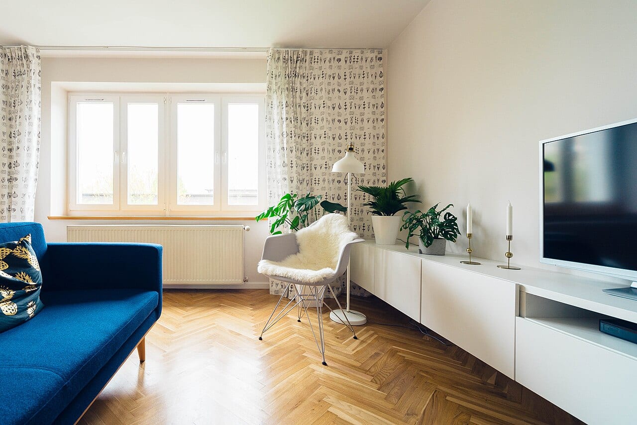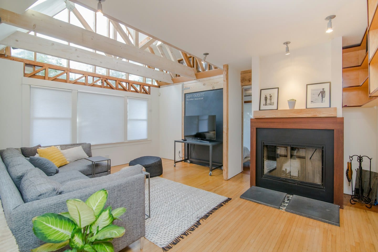
A small square of color on a white poster board rarely tells the full story of how a room will feel once the walls are transformed. What looks like a soft, warm sand in the bright light of a hardware store might shift into something entirely different when placed against your existing furniture or under the glow of a floor lamp in the evening.
The Importance of Personal Labeling
The first step in a successful color selection is organization. When you collect various swatches or small sample pots, the temptation is to rely on memory or the vague descriptions provided on the containers. However, once those samples are spread across a dining table or taped to a hallway, the subtle differences between shades can begin to blur.
Take a moment to label each sample immediately. Use a permanent marker to note the specific name or code on the back of every piece. This prevents the frustration of staring at two nearly identical greys, unable to remember which one is the cooler tone and which is the warmer one. By creating a clear connection between the physical sample and its identity, you remove the guesswork from the comparison process.
Observing the Room in Motion
Color is not a static thing; it reacts to the rhythms of your household. To see a color accurately, you must observe it in the specific environment where it will live. Instead of looking at samples in a single burst of afternoon light, check them at different intervals throughout the day.
For example, if you are deciding on a color for a breakfast nook, observe the samples during the early morning sun, mid-afternoon, and again under the artificial light used during dinner. A shade that feels energetic and bright at 10:00 a.m. might feel heavy or dim by 8:00 p.m. Watching how the light moves across the sample provides a sense of how the room will transition from a morning coffee spot to an evening relaxation area.
Navigating Group Decisions
Deciding on a palette becomes more complex when you are not the only person with a vote. Imagine a situation where you and your partner are renovating a shared guest suite, but you are also coordinating with a visiting family member who will be staying there frequently. You might find yourself caught between a color that feels sophisticated to you and one that feels welcoming to them. In these moments, the tradeoff is often between personal preference and communal comfort.
To manage these differing perspectives, bring everyone into the observation process. Instead of presenting a single "winner," lay out all the labeled samples in the room together. Ask each person how a specific shade makes them feel in that light. This shifts the conversation from a debate over which color is "better" to a shared observation of how each option affects the atmosphere of the space.
Once you have observed the samples through various lighting conditions and gathered everyone's input, you can move forward with confidence. The goal is to ensure the final choice feels right not just in the store, but in the actual life you lead within those walls.